
.jpg)
PROTECT YOUR DNA WITH QUANTUM TECHNOLOGY
Orgo-Life the new way to the future Advertising by Adpathway
7 Matplotlib Tricks to Better Visualize Your Machine Learning Models
Image by Author | ChatGPT
Introduction
Visualizing model performance is an essential piece of the machine learning workflow puzzle. While many practitioners can create basic plots, elevating these from simple charts to insightful, elevated visualizations that can help easily tell the story of your machine leanring model’s interpretations and predictions is a skill that sets great professionals apart. The Matplotlib library, the foundational plotting tool in the scientific and computational Python ecosystem, is packed with features that can help you achieve this.
This tutorial provides 7 practical Matplotlib tricks that will help you better understand, evaluate, and present your machine learning models. We’ll move beyond the default settings to create visualizations that are not only aesthetically pleasing but also rich in information. These techniques are designed to integrate smoothly into your workflow with libraries like NumPy and Scikit-learn.
The assumption here is that you are already familiar with Matplotlib and its general usage, as we won’t be covering that here. Instead, we will focus on how to improve your skills with code for 7 specific machine learning task-related scenarios.
Since we will take the approach of treating each of our code solutions independently, get ready to see import matplotlib.pyplot as plt quite a bit today 🙂
1. Applying Professional Styles for Instant Polish
The default look of Matplotlib can sometimes feel a bit… dated. A simple yet effective trick for an elevated experience is to use Matplotlib’s built-in style sheets. With a single line of code, you can apply professional themes that mimic the aesthetics of popular tools like R’s ggplot or the Seaborn library. This instantly improves readability and visual appeal.
Let’s see the difference a style sheet can make. We’ll start with a basic scatter plot and then apply the 'seaborn-v0_8-whitegrid' style.
|
1 2 3 4 5 6 7 8 9 10 11 12 13 14 15 16 17 18 19 20 21 22 23 24 25 26 27 28 29 30 31 |
import matplotlib.pyplot as plt import numpy as np # Generate some sample data x = np.linspace(0, 10, 50) y = np.sin(x) + np.random.normal(0, 0.2, 50) sizes = np.random.rand(50) * 100 # Default plot plt.figure(figsize=(12, 5)) plt.subplot(1, 2, 1) plt.scatter(x, y, s=sizes, alpha=0.7) plt.title('Default Matplotlib Style') plt.xlabel('X Value') plt.ylabel('Y Value') # Apply a professional style plt.style.use('seaborn-v0_8-whitegrid') # Styled plot plt.subplot(1, 2, 2) plt.scatter(x, y, s=sizes, alpha=0.7, c=y, cmap='viridis') plt.title("Style: 'seaborn-v0_8-whitegrid'") plt.xlabel('X Value') plt.ylabel('Y Value') plt.tight_layout() plt.show() # Reset to default style if needed for further plots plt.style.use('default') |
Here is the generated visualization:
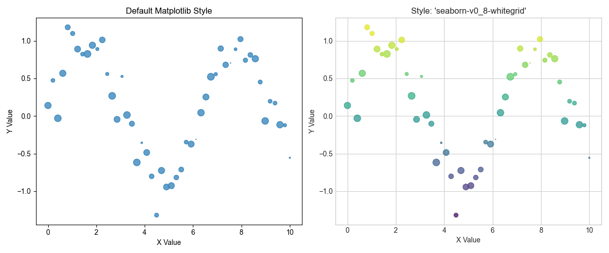
Applying professional styles for instant polish
As you can see, applying a style adds a grid, changes the font, and adjusts the overall color scheme, making the plot much easier to interpret.
2. Visualizing Classifier Decision Boundaries
Understanding how a classification model separates data is a must. A decision boundary plot shows the regions of the feature space that a model associates with each class. This visualization is an invaluable tool for diagnosing how a model generalizes and where it might be making errors.
We’ll train a Support Vector Machine (SVM) on the classic Iris dataset and plot its decision boundaries. To make it visible in 2D, we’ll only use two features. The trick is to create a mesh grid of points and have the model predict the class for each point, then use plt.contourf() to draw the colored regions.
|
1 2 3 4 5 6 7 8 9 10 11 12 13 14 15 16 17 18 19 20 21 22 23 24 25 26 27 28 29 30 31 32 |
import numpy as np import matplotlib.pyplot as plt from sklearn import svm, datasets # Load iris dataset and use only the first two features iris = datasets.load_iris() X = iris.data[:, :2] y = iris.target # Create an instance of SVM and fit the data C = 1.0 # SVM regularization parameter svc = svm.SVC(kernel='linear', C=C).fit(X, y) # Create a mesh to plot in x_min, x_max = X[:, 0].min() - 1, X[:, 0].max() + 1 y_min, y_max = X[:, 1].min() - 1, X[:, 1].max() + 1 xx, yy = np.meshgrid(np.arange(x_min, x_max, 0.02), np.arange(y_min, y_max, 0.02)) # Predict the class for each point in the mesh Z = svc.predict(np.c_[xx.ravel(), yy.ravel()]) Z = Z.reshape(xx.shape) # Plot the decision boundary plt.figure(figsize=(8, 6)) plt.contourf(xx, yy, Z, cmap=plt.cm.coolwarm, alpha=0.8) # Plot the training points plt.scatter(X[:, 0], X[:, 1], c=y, cmap=plt.cm.coolwarm, edgecolors='k') plt.xlabel('Sepal length') plt.ylabel('Sepal width') plt.title('SVM Decision Boundaries') plt.show() |
And here are our classifier decision boundaries, visualized:
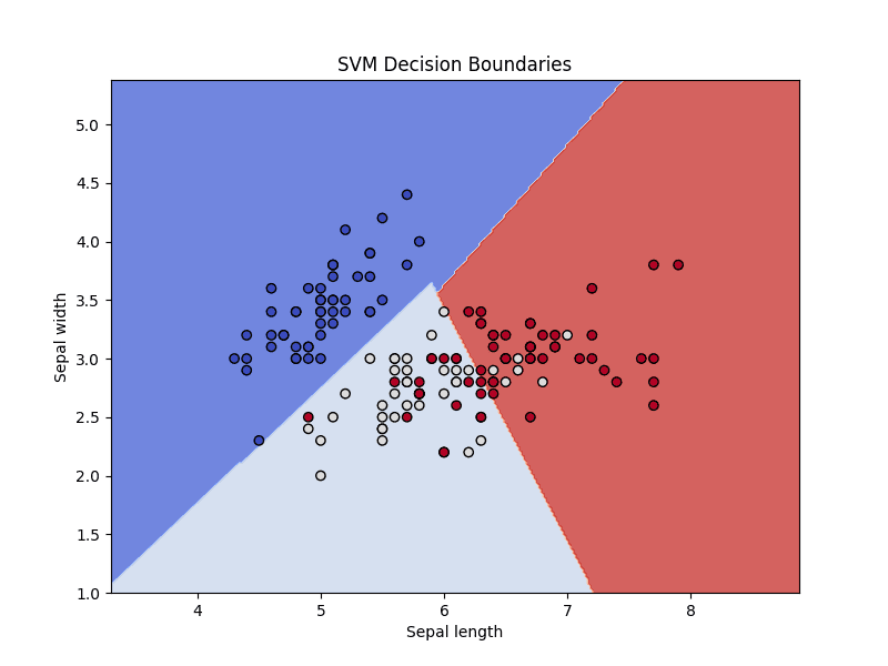
Visualizing classifier decision boundaries
This plot shows how the SVM classifier divvies up the feature space, separating the three species of iris.
3. Plotting a Clear Receiver Operating Characteristic Curve
The Receiver Operating Characteristic (ROC) curve is a standard tool for evaluating binary classifiers. The ROC plots the true positive rate against the false positive rate at various threshold settings. The Area Under the Curve (AUC) provides a single number to summarize the model’s performance, as presented in the ROC plot. A good ROC plot should include the AUC score and a baseline for comparison.
Let’s use Scikit-learn to calculate the ROC curve points and AUC, then use Matplotlib to plot them cleanly. Adding a label with the AUC score makes the plot self-contained and easy to understand.
|
1 2 3 4 5 6 7 8 9 10 11 12 13 14 15 16 17 18 19 20 21 22 23 24 25 26 27 28 29 30 31 32 33 |
import matplotlib.pyplot as plt from sklearn.datasets import make_classification from sklearn.model_selection import train_test_split from sklearn.linear_model import LogisticRegression from sklearn.metrics import roc_curve, roc_auc_score # Generate synthetic data X, y = make_classification(n_samples=1000, n_classes=2, random_state=42) X_train, X_test, y_train, y_test = train_test_split(X, y, test_size=0.3, random_state=42) # Train a model model = LogisticRegression() model.fit(X_train, y_train) # Predict probabilities y_probs = model.predict_proba(X_test)[:, 1] # Calculate ROC curve and AUC fpr, tpr, thresholds = roc_curve(y_test, y_probs) auc = roc_auc_score(y_test, y_probs) # Plotting the ROC curve plt.figure(figsize=(8, 6)) plt.plot(fpr, tpr, color='darkorange', lw=2, label=f'ROC curve (AUC = {auc:.2f})') plt.plot([0, 1], [0, 1], color='navy', lw=2, linestyle='--', label='Random Classifier') plt.xlim([0.0, 1.0]) plt.ylim([0.0, 1.05]) plt.xlabel('False Positive Rate') plt.ylabel('True Positive Rate') plt.title('Receiver Operating Characteristic (ROC) Curve') plt.legend(loc="lower right") plt.grid(True) plt.show() |
And here is the resulting robust ROC curve plot:

Plotting a clear receiver operating characteristic curve
4. Building an Annotated Confusion Matrix Heatmap
A confusion matrix is a table summarizing the performance of a classification model. Raw numbers are useful here, but a heatmap visualization makes it much faster to spot patterns, such as which classes are commonly confused. Annotating the heatmap with the actual numbers provides both a quick visual summary and precise details.
We’ll use Matplotlib’s imshow() function to create the heatmap and then loop through the matrix to add text labels to each cell.
|
1 2 3 4 5 6 7 8 9 10 11 12 13 14 15 16 17 18 19 20 21 22 23 24 25 26 27 28 29 30 31 32 33 34 35 36 37 38 39 40 41 |
import numpy as np import matplotlib.pyplot as plt from sklearn.metrics import confusion_matrix from sklearn.datasets import make_classification from sklearn.model_selection import train_test_split from sklearn.ensemble import RandomForestClassifier # Generate data and make predictions X, y = make_classification(n_samples=1000, n_features=10, n_informative=5, n_redundant=0, n_classes=3, n_clusters_per_class=1, random_state=42) X_train, X_test, y_train, y_test = train_test_split(X, y, test_size=0.3, random_state=42) model = RandomForestClassifier(random_state=42) model.fit(X_train, y_train) y_pred = model.predict(X_test) # Compute confusion matrix cm = confusion_matrix(y_test, y_pred) classes = ['Class 0', 'Class 1', 'Class 2'] # Plotting the confusion matrix fig, ax = plt.subplots(figsize=(8, 6)) im = ax.imshow(cm, interpolation='nearest', cmap=plt.cm.Blues) ax.figure.colorbar(im, ax=ax) ax.set(xticks=np.arange(cm.shape[1]), yticks=np.arange(cm.shape[0]), xticklabels=classes, yticklabels=classes, title='Confusion Matrix', ylabel='True label', xlabel='Predicted label') # Loop over data dimensions and create text annotations. thresh = cm.max() / 2. for i in range(cm.shape[0]): for j in range(cm.shape[1]): ax.text(j, i, format(cm[i, j], 'd'), ha="center", va="center", color="white" if cm[i, j] > thresh else "black") fig.tight_layout() plt.show() |
Here is the resulting easy-to-quickly-interpret confusion matrix:
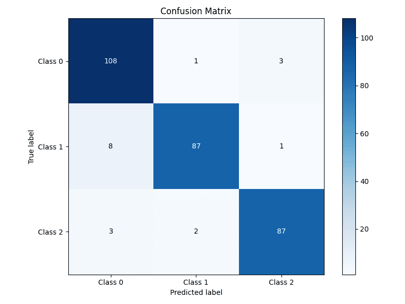
Building an annotated confusion matrix heatmap
5. Highlighting Feature Importance
For many models, especially tree-based ensembles like random forests or gradient boosting, we can extract a measure of how important each feature was in making predictions. Visualizing these scores helps in understanding the model’s behavior and guiding feature selection efforts. A horizontal bar chart is often the best choice for this task.
We’ll train a RandomForestClassifier, extract the feature importances, and display them in a sorted horizontal bar chart for easy comparison.
|
1 2 3 4 5 6 7 8 9 10 11 12 13 14 15 16 17 18 19 20 21 22 23 24 25 26 27 |
import numpy as np import matplotlib.pyplot as plt from sklearn.datasets import make_classification from sklearn.ensemble import RandomForestClassifier # Generate synthetic data X, y = make_classification(n_samples=1000, n_features=10, n_informative=5, n_redundant=0, random_state=42) # Train the model model = RandomForestClassifier(n_estimators=100, random_state=42) model.fit(X, y) # Get feature importances importances = model.feature_importances_ feature_names = [f'Feature {i}' for i in range(X.shape[1])] # Sort feature importances in descending order indices = np.argsort(importances)[::-1] # Plotting the feature importances plt.figure(figsize=(10, 6)) plt.title("Feature Importances") plt.barh(range(X.shape[1]), importances[indices], align="center") plt.yticks(range(X.shape[1]), [feature_names[i] for i in indices]) plt.gca().invert_yaxis() # Display the most important features at the top plt.xlabel("Importance Score") plt.show() |
Let’s take a look at the feature importances plotted:
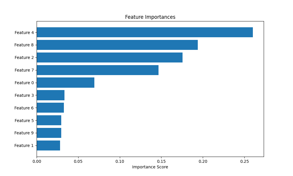
Highlighting feature importance
6. Plotting Diagnostic Learning Curves
Learning curves are a powerful tool for diagnosing whether a model is suffering from a bias problem (underfitting) or a variance problem (overfitting). They show the model’s performance on the training set and the validation set as a function of the number of training samples.
We’ll use Scikit-learn’s learning_curve utility to generate the scores and then plot them. A key trick here is to also plot the standard deviation of the scores to understand the stability of the model’s performance.
|
1 2 3 4 5 6 7 8 9 10 11 12 13 14 15 16 17 18 19 20 21 22 23 24 25 26 27 28 29 30 31 32 33 34 35 36 |
import numpy as np import matplotlib.pyplot as plt from sklearn.datasets import load_digits from sklearn.model_selection import learning_curve from sklearn.linear_model import LogisticRegression # Load data X, y = load_digits(return_X_y=True) # Define the model estimator = LogisticRegression(max_iter=10000, solver='liblinear') # Calculate learning curve scores train_sizes, train_scores, test_scores = learning_curve(estimator, X, y, cv=5, n_jobs=-1, train_sizes=np.linspace(.1, 1.0, 10)) # Calculate mean and standard deviation for training and test scores train_scores_mean = np.mean(train_scores, axis=1) train_scores_std = np.std(train_scores, axis=1) test_scores_mean = np.mean(test_scores, axis=1) test_scores_std = np.std(test_scores, axis=1) # Plotting the learning curve plt.figure(figsize=(10, 6)) plt.title("Learning Curve") plt.xlabel("Training examples") plt.ylabel("Score") plt.grid(True) plt.fill_between(train_sizes, train_scores_mean - train_scores_std, train_scores_mean + train_scores_std, alpha=0.1, color="r") plt.fill_between(train_sizes, test_scores_mean - test_scores_std, test_scores_mean + test_scores_std, alpha=0.1, color="g") plt.plot(train_sizes, train_scores_mean, 'o-', color="r", label="Training score") plt.plot(train_sizes, test_scores_mean, 'o-', color="g", label="Cross-validation score") plt.legend(loc="best") plt.show() |
This is the resulting learning curve plot:
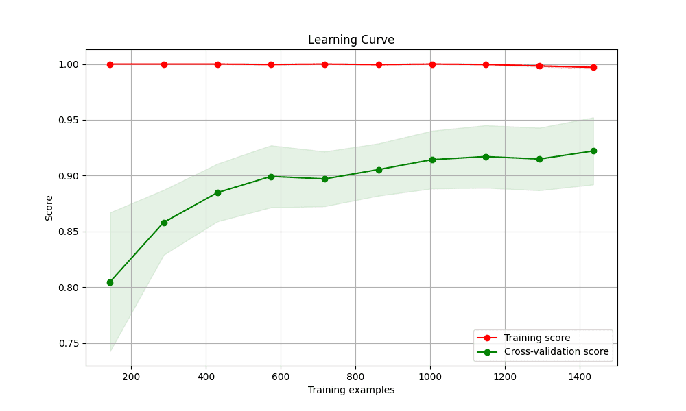
Plotting diagnostic learning curves
7. Creating a Gallery of Models with Subplots
There are times when you will want to compare the performance of several different models. Placing their visualizations side-by-side in a single figure makes this comparison direct and efficient. Matplotlib’s subplot functionality is perfect for creating this kind of “model gallery.”
We’ll create a grid of plots, with each subplot showing the decision boundary for a different classifier on the same dataset.
|
1 2 3 4 5 6 7 8 9 10 11 12 13 14 15 16 17 18 19 20 21 22 23 24 25 26 27 28 29 30 31 32 33 34 35 36 37 38 39 40 41 42 43 44 45 46 47 48 49 50 51 52 53 54 55 |
import numpy as np import matplotlib.pyplot as plt from sklearn.model_selection import train_test_split from sklearn.preprocessing import StandardScaler from sklearn.datasets import make_moons from sklearn.neighbors import KNeighborsClassifier from sklearn.svm import SVC from sklearn.tree import DecisionTreeClassifier from sklearn.ensemble import RandomForestClassifier # Create a dataset X, y = make_moons(noise=0.3, random_state=42) X = StandardScaler().fit_transform(X) X_train, X_test, y_train, y_test = train_test_split(X, y, test_size=.4, random_state=42) # Define classifiers classifiers = { "KNN": KNeighborsClassifier(3), "Linear SVM": SVC(kernel="linear", C=0.025), "RBF SVM": SVC(gamma=2, C=1), "Decision Tree": DecisionTreeClassifier(max_depth=5), "Random Forest": RandomForestClassifier(max_depth=5, n_estimators=10, max_features=1), } # Create a mesh grid x_min, x_max = X[:, 0].min() - .5, X[:, 0].max() + .5 y_min, y_max = X[:, 1].min() - .5, X[:, 1].max() + .5 xx, yy = np.meshgrid(np.arange(x_min, x_max, 0.02), np.arange(y_min, y_max, 0.02)) # Create subplots fig, axes = plt.subplots(1, len(classifiers), figsize=(15, 4)) for i, (name, clf) in enumerate(classifiers.items()): ax = axes[i] clf.fit(X_train, y_train) score = clf.score(X_test, y_test) # Plot decision boundary Z = clf.predict(np.c_[xx.ravel(), yy.ravel()]) Z = Z.reshape(xx.shape) ax.contourf(xx, yy, Z, cmap=plt.cm.RdBu, alpha=.8) # Plot training and test points ax.scatter(X_train[:, 0], X_train[:, 1], c=y_train, cmap=plt.cm.RdBu, edgecolors='k') ax.scatter(X_test[:, 0], X_test[:, 1], c=y_test, cmap=plt.cm.RdBu, edgecolors='k', alpha=0.6) ax.set_xlim(xx.min(), xx.max()) ax.set_ylim(yy.min(), yy.max()) ax.set_xticks(()) ax.set_yticks(()) ax.set_title(name) ax.text(xx.max() - .3, yy.min() + .3, f'{score:.2f}'.lstrip('0'), size=15, horizontalalignment='right') plt.tight_layout() plt.show() |
Here are the gallery of the various different classifier’s decision boundaries:
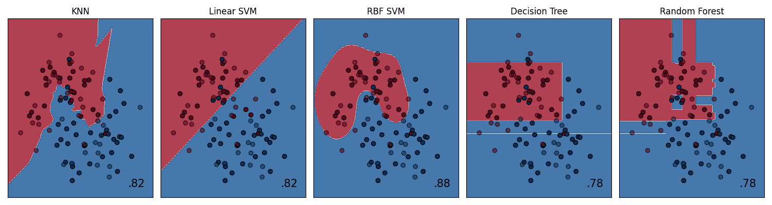
Creating a gallery of models with subplots
Wrapping Up
Mastering these 7 Matplotlib tricks will significantly enhance your ability to analyze, diagnose, and communicate the results of your machine learning models. Effective visualization is not only about creating pretty pictures; it’s about crafting and presenting a deeper intuition for how models work and conveying complex findings in a clear, impactful way. By moving beyond default plots and thoughtfully crafting your visualizations, you can accelerate your own understanding and more effectively share your insights with others.


 English (US) ·